Searching for a Porsche 911 vintage poster is frustrating for a reason that has nothing to do with the cars. Several photographs of a classic 911 can be described honestly with the same six words, so the titles all look alike and none of them tells you what you would actually be hanging. This catalogue has that problem too. So here is the difference between the pieces, stated in terms of what is in the frame.
Two racing pictures that are not the same picture
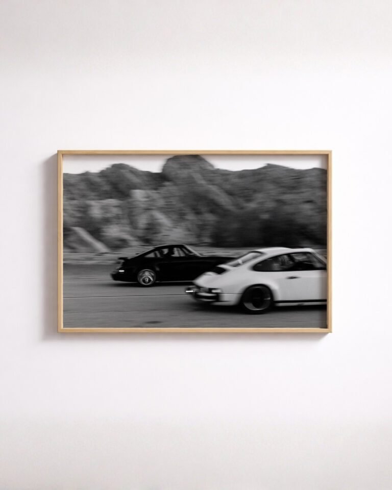
The pair that causes the most confusion are both black-and-white photographs of two classic 911s running side by side. They are different photographs, and the tell is the background.
The vintage Porsche 911 racing poster has trees behind the cars, pulled into blur by the panning. The background is soft and close, and the effect is claustrophobic in a good way — a road cut through woodland, with no horizon to give you a sense of scale. The cars feel fast because there is nothing steady to measure them against.
The vintage Porsche 911s racing wall art puts the same subject below rugged mountains. There is a horizon, there is distance, and the cars are smaller in the frame. It reads as a landscape with a race in it, and the sense of speed comes from the road rather than from the blur.
That is the whole difference, and it decides the room. The tree version is the tighter, more graphic picture and it works on a smaller wall. The mountain version wants width, and it wants to be seen from further back.

The one with horses in it
The vintage Porsche 911 poster with horses is the outlier, and it is the one we would recommend to most people who are not specifically buying a car print. A classic 911 parked in a misty field, two horses beside it, all in black and white.
It works because it is a photograph before it is a car photograph. Somebody with no interest in Porsche will read it as a landscape and stop at it anyway. That makes it the only piece in this group that hangs comfortably in a living room, a hallway or a bedroom rather than an office or a garage — the others announce their subject too loudly for that.
The colour one
There is also a full-colour photograph of a gold classic 911 beside a coastal road. It is the only piece in the vintage 911 group that is not monochrome, and colour changes its behaviour completely: it is warm, it dates itself through the paint, and it dominates a wall in a way none of the black-and-white pieces do. Buy it if you want the picture to be the event in the room. Avoid it if you are building a group of frames that need to sit together.
Telling one Porsche 911 vintage poster from another
Reduced to a single line each:
- Trees behind, tight crop. The most kinetic of the group. Small-to-medium wall.
- Mountains behind, wide. A landscape that contains a race. Broad wall, viewed from distance.
- Field and horses. The one that is not really about cars. Goes anywhere.
- Gold car, coast, colour. The loudest. Needs its own wall.
- A 911 beneath an iron tower in a city plaza. Architecture and car in equal measure, and the most urban of the set.
What we will not do is tell you which model year any of these cars is. The shape says classic 911 and the evidence stops there. Where the model is genuinely identifiable — the 930 Turbo, with its wide arches and its tail — we say so on that product and write about it separately.

Why they all look like the same car
There is a real reason these pictures are hard to tell apart beyond the backgrounds, and it is not laziness on anyone’s part. The 911 has held one silhouette for six decades, which is close to unique among cars still in production. That is why a classic 911 in a field and a classic 911 on a mountain road read as the same object, while two saloons from the same two decades would not.
Porsche’s own history covers the competition side of this: the company documents the 911 R as a racing derivative of the road car, and the Porsche Museum documents the 911 Carrera RSR, the wide-arched competition car that most vintage racing imagery of the type descends from. The road car and the race car kept the same outline, and that is the reason a photograph of one looks like a photograph of the other.
Practical notes
All of these are made to order and ship worldwide at no extra charge, so nothing here is a stock decision. The decisions that matter are orientation and tone: the racing pieces are landscape and want a horizontal wall, and the monochrome pieces will group with each other while the colour piece will not.
For the reason the shape never changed, we have a longer piece on the 911 silhouette. For the racing history behind the wide-arch cars, there is our account of the 911 in competition.
Common questions
Why are there several similar vintage Porsche 911 posters?
Because they are genuinely different photographs of a similar subject, and the titles do not make that obvious. Two show 911s racing, and the difference between them is the background - blurred trees in one, mountains in the other. One shows a car parked beside horses. One is a colour photograph of a gold car by the coast. This article exists to separate them.
Which is the most versatile of them?
The field-and-horses piece, by a distance. It is the only one that reads as a landscape photograph first and a car photograph second, which means it hangs in rooms the racing pieces would look out of place in.
Are these pictures of a specific model year?
We are not going to claim one. The cars are recognisably classic 911s and that is as far as the evidence in the frame goes. Where a model can be identified from the shape - the 930 Turbo is the clear case - we say so on that product instead.
Do any of them come in colour?
One does: the coastal piece is a full-colour photograph of a gold car. The rest of the vintage 911 group is monochrome.