Clothes date slowly. Colour dates fast. That is the whole argument for black and white fashion photography on a wall, and it is the reason an image from decades ago can sit in a room without announcing which decade it came from.
You can watch the effect work in reverse. A colour fashion photograph carries the palette of its season — the particular greens and oranges a year decided it liked — and the palette is what the eye reads first. Take the colour out and what is left is cut, line, posture and light. Those age at the speed of the human body, which is to say hardly at all.
The genre began soft, and it began in 1911
Fashion photography has a startable date. In 1911, Edward Steichen photographed models wearing dresses by the couturier Paul Poiret; thirteen soft-focus images were printed in the magazine Art et Décoration, and Steichen later called them “the first serious fashion photographs ever made”. The account and the quotation are the Victoria and Albert Museum’s, in its history of a hundred years of fashion photography.
Two details in that sentence matter more than the date. The images were soft focus — the genre did not begin with the crisp, hard-lit look people now think of as fashion photography. And they were made to argue that dress belonged to art rather than to trade. Fashion photography started as a claim about seriousness, which is a better foundation for a wall piece than it sounds.

Then it got a job
The move from experiment to industry happened through one publisher. Steichen worked as chief photographer for Condé Nast Publications from 1923 to 1937 — the dates the Whitney Museum of American Art gives for the post, and the period the Art Institute of Chicago catalogues simply as “Condé Nast, 1923–1937”. He shot for Vogue throughout, and for Vanity Fair until that title was folded into Vogue in 1936. That is fourteen years of a single photographer setting the visual grammar of two magazines, and it is where most of the conventions still in use were fixed: the figure isolated against a plain ground, light doing the modelling, the garment given the dignity of a portrait subject.
Worth noting, because it connects two things that look unrelated: Steichen also designed the cover of the first issue of Camera Work in January 1903, Alfred Stieglitz’s journal, which ran until 1917 — the Metropolitan Museum of Art records both in its account of Stieglitz and American photography. The man who helped define art photography’s soft-focus period is the same man who then went and industrialised fashion photography. The two halves of the medium were never as separate as they are usually described.
Colour arrived, and fashion took it first
Colour did not stay exotic for long. The Victoria and Albert Museum’s history singles out Erwin Blumenfeld in the 1940s favouring Kodachrome film, “which enabled his vivid images to leap from the magazine page” — and leaping from the page is precisely what a magazine wants. A magazine is bought, read and thrown away. It should shout.
A wall is the opposite instrument. You are not deciding whether to pick it up at a newsstand; you are deciding whether you can live with it for ten years in your own light. The qualities that sell a cover — saturation, novelty, the colour of the moment — are the qualities that wear out first in a room. Monochrome gives up the shout and keeps the structure.

There is a literal, material version of the same point. The University of Illinois Library’s Preservation Self-Assessment Program rates the risk to chromogenic colour prints as moderately high, noting that a chromogenic print made before the mid-1980s “will invariably lose its image in time, even in dark storage”, while it rates fibre-based black-and-white silver gelatin prints as moderately low risk. That is a statement about physical prints of a particular era rather than about colour photography in general — but it is the same asymmetry turning up in the chemistry.
This is not a claim that colour fashion photography is inferior. It is a claim about a specific use. If you want an image that reads as of its time, colour is the better tool. If you want one that reads as a photograph rather than as a date stamp, take the colour out.
The frames here are anonymous, and that is not an accident
A note about what this shop does and does not know, because it bears directly on how these images work.
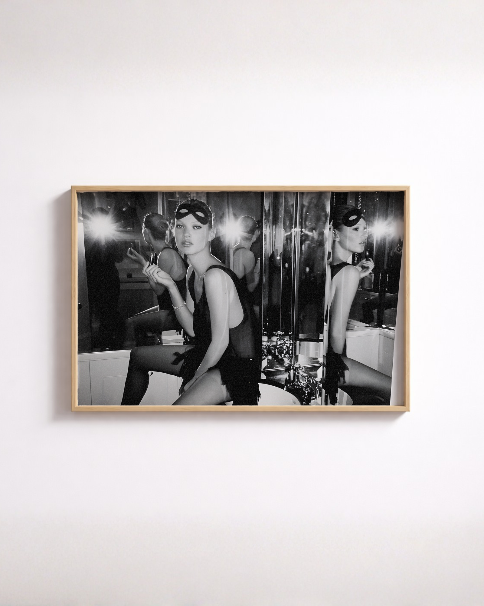
We do not know who is in these photographs. We do not know who made them, where they were taken, or when. We will not tell you otherwise, and you should treat any print seller who supplies that detail without a source with the same suspicion you would apply anywhere else. Everything historical on this page is attributed to a museum or an institutional archive; nothing on this page is a claim about our own images.
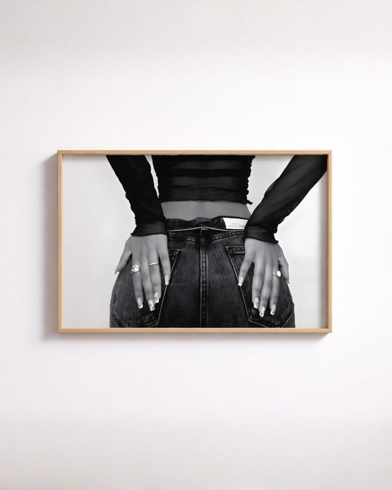
That sounds like a limitation and it is, but it also happens to describe how these pictures function on a wall. A fashion photograph that is about a recognisable person is a poster of that person — it works by reference, and it takes over the room. A fashion photograph in which the figure is unnamed works the way a figure study works: as shape, weight and gesture. The fashion figure study and the grouped models poster both do this. Nobody walking into the room is going to ask you who it is, because the picture is not offering a who. It is offering a how.
The same logic runs through the editorial portrait, where the styling is deliberately ordinary — denim, plain ground — so that everything expressive has to come from posture and light. It is the hardest version of the genre to bring off and the easiest to live with.

Choosing black and white fashion photography, and where it goes
Some judgement, offered as judgement rather than as a rule.
- Fashion work wants a plain wall. These images are already busy with tonal information. Patterned wallpaper fights them and the wallpaper wins.
- It is not automatically a bedroom picture. The reflex is to put figure and fashion work somewhere private. Editorial fashion is graphic, formal and slightly cool in temperature, which makes it hold up well in a hallway, a study or an office — rooms where a landscape would go soft and unnoticed.
- One is usually enough. Fashion images have a strong centre of gravity. Two in the same sightline compete; one, with something quieter beside it, does not.
- Scale up rather than down. A small fashion print reads as a page torn from a magazine, which is the association you are trying to avoid.
On paper and light, the answers are the same as for any monochrome print, and we set them out in black-and-white prints on matte paper. If the softness of the 1911 images is the part that appeals, the genre that grew out of it is covered in blur on purpose. And if what draws you is the figure rather than the clothes, that is a different genre with a longer history, in what a figure study is.
Common questions
Does a fashion photograph date a room?
A colour one can. It carries the palette of its season, and the palette is what the eye reads first, so the picture announces its year before it shows you anything else. Take the colour out and what remains is cut, line, posture and light, which age at the speed of the human body.
Do you know who is in these photographs?
No. We do not know the sitter, the photographer, the place or the date, and we will not invent any of them. Everything historical in our writing is attributed to a museum or an institutional archive. Treat any print seller who supplies that detail without a source the way you would anywhere else.
Is an unnamed figure a drawback?
On a wall it is usually the opposite. A photograph of a recognisable person works by reference and takes over the room, because the first thing anyone asks is who. An unnamed figure works as shape, weight and gesture, which is what a figure study does. It offers a how rather than a who.
Was fashion photography always sharp and hard-lit?
No. It started soft. In 1911 Edward Steichen photographed models wearing dresses by Paul Poiret, and thirteen soft-focus images were printed in the magazine Art et Décoration — Steichen later called them the first serious fashion photographs ever made. The crisp look people now picture came a good deal later.
Is a colour print or a monochrome one the sturdier object?
The University of Illinois Library's Preservation Self-Assessment Program rates chromogenic colour prints as moderately high risk, noting that one made before the mid-1980s will invariably lose its image in time, even in dark storage, and rates fibre-based black-and-white silver gelatin as moderately low. That describes prints of a particular era, not colour in general.