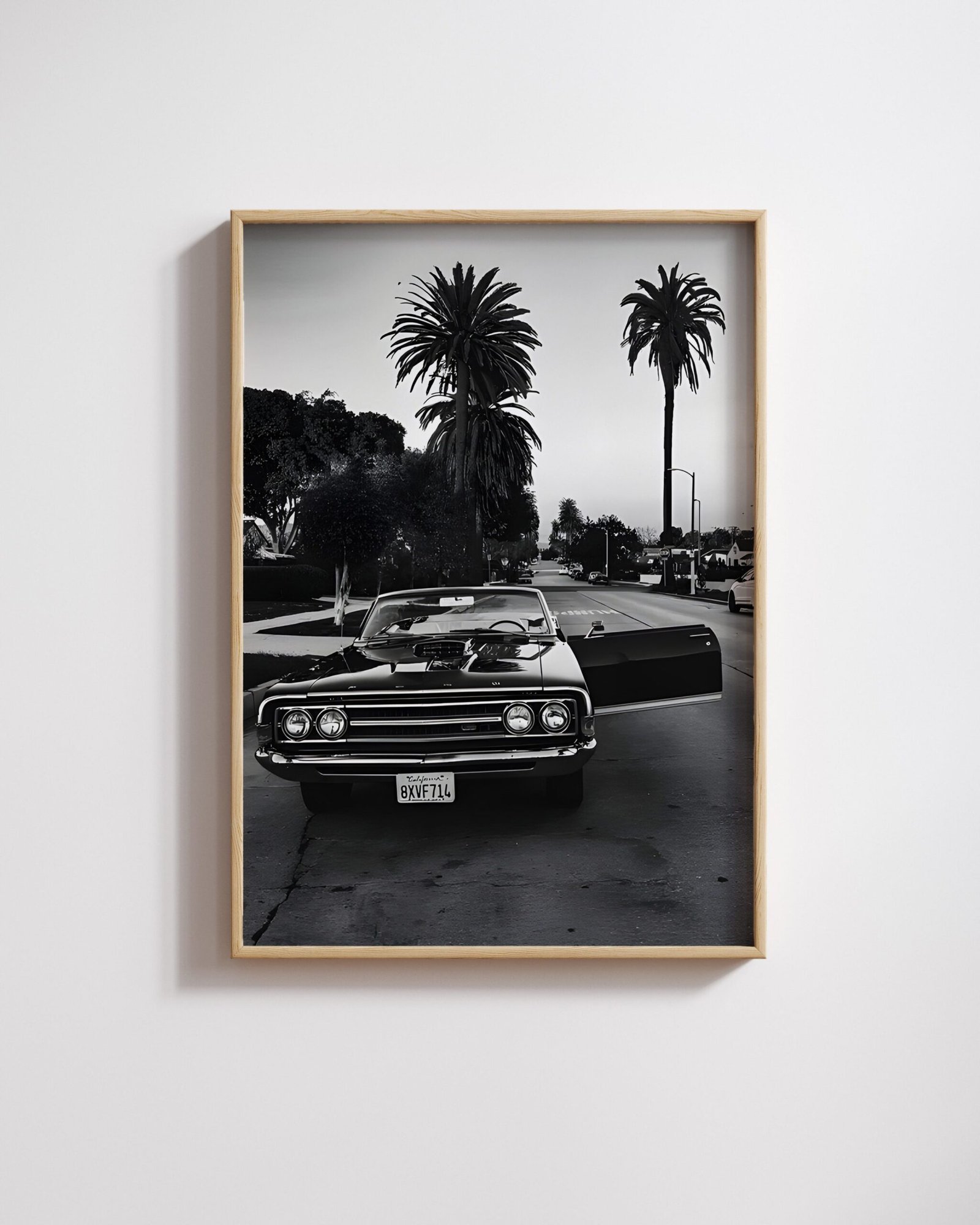
Buy one black-and-white print and the only decision is whether you like it. Buy three, and a new question turns up that nobody warns you about: do they belong together, or do they just happen to be hanging on the same wall? Building black and white photography wall art as a considered group rather than one piece at a time comes down to a single distinction, and it is not the subject. It is tone.
Subject is the wrong filter
The instinct is to group by what the pictures are of – three cars together, or three portraits together. That produces a matched set that still looks like three separate purchases, because photographs of the same kind of thing, shot differently, tend to compete rather than support each other. What actually reads as a set is contrast level and light direction: two hard-lit, high-contrast frames sit together regardless of whether one shows a car and the other a building. A soft, low-contrast image dropped into that same group reads as a mistake, not a variation.
A museum holding 800,000 photographs does not sort them by photographer
The Victoria and Albert Museum holds close to 800,000 photographs, spanning the 1820s to the present. Walk its Photography Centre and the rooms are not organised photographer by photographer, or subject by subject. Its own account of the space describes galleries built around “thematic histories of photography through the lens of the V&A collection” – periods, processes and ideas, with wildly different photographers and subjects sharing a room because the thread connecting them is not who took the picture. A home wall can borrow the same logic on a much smaller scale: the thread is not who or what is in the frame, it is how the frame was made.

Five hundred photographers, one wall
The most extreme version of this idea was tested at full scale in 1955, when Edward Steichen assembled The Family of Man for the Museum of Modern Art in New York. According to the Steichen Collections in Clervaux Castle, Luxembourg – which now holds the exhibition permanently, listed on UNESCO’s Memory of the World register – the show combined 503 photographs by 273 different photographers from 68 countries. The images were not grouped by photographer or nationality. They were, in the collection’s own words, “chosen according to their capacity of communication,” staged as a single continuous “photographic essay.” Nobody visiting in 1955 needed to know or care which of 273 photographers took any individual picture, because the installation itself did the work of making them read as one thing. A wall of three, five or seven prints from a single small shop is a much smaller version of exactly that trick.

Building black and white photography wall art of your own
- Match contrast level, not content. Put the hardest-lit, most graphic images together, and the softer, more tonal ones together. Mixing the two groups in one sightline is the single most common way a set stops working.
- Odd numbers hold a wall better than even ones. Three or five reads as a considered group; two reads as a pair missing something, and four tends to split the eye down the middle.
- Let one print be the largest. A group where every print is the same size looks like a spec sheet. One dominant size with two or four smaller companions gives the eye somewhere to land first.
- Cross the catalogue on purpose. A 1967 Mustang next to a New York street frame is a stronger set than two car prints of similar vintage, precisely because the subjects being unrelated proves the tone is doing the work.
- Frame consistently or not at all. A framed print and an unframed print in the same grouping reads as unfinished rather than deliberate – pick one and use it across the whole group.
Two prints on this page make the same point visually rather than in words. Paul Strand’s hard-edged shadow study is severe and graphic; Gertrude Kasebier’s platinum portrait is soft and diffused. Neither would sit comfortably next to the other on the same short wall – but each would sit easily next to something else at its own contrast level, whatever the subject.
The paper and light questions that apply to any single monochrome print apply here too, and we set them out at more length in black-and-white prints on matte paper. If the sticking point is the subject itself rather than how many to hang, why black-and-white photography still wins on a wall makes the underlying case, and the photographers who made black and white famous covers the people who proved it first.
Common questions
How many black-and-white prints should I hang together?
Three or five works better than two or four for most walls. An odd number reads as a considered group; an even number tends to split into pairs, and two prints alone can look like a set with a piece missing rather than a deliberate choice.
Do black-and-white prints need to match in size to work as a set?
No - a group where every print is identical in size often reads as flat. One larger print with two or four smaller companions gives the eye a place to land first, then lets it move around the smaller pieces.
Can I mix car photography and a New York street print on the same wall?
Yes, and it often works better than pairing similar subjects. What holds a group together is contrast and tone, not subject - two unrelated subjects with the same hard-lit, high-contrast look will read as a set; two similar subjects shot very differently will not.
Should every print in a group be framed the same way?
Consistency matters more than the choice itself. Mixing a framed print with an unframed one in the same grouping reads as unfinished rather than deliberate, even when each print on its own would look perfectly fine. Pick framed or unframed for the whole group, and apply that one decision across every piece rather than deciding print by print.


