Black and white fashion prints are one of the few categories of wall art that almost always work and almost always get chosen badly. The medium is forgiving — monochrome flatters nearly any well-lit photograph of a body or a garment — and that is exactly the trap. What separates a picture you still like in five years from one you stop seeing in five weeks is not the tonality. It is the crop.
Where the genre came from, and why it matters here
Fashion photography has a startlingly precise origin. The V&A’s survey of the field puts it in 1911, when Edward Steichen photographed models wearing dresses by the designer Paul Poiret and thirteen soft-focus images were printed in the magazine Art et Decoration. Steichen later called them the first serious fashion photographs ever made. Two years earlier the publisher Conde Nast had bought Vogue, and the industry that followed was built on that pairing.
What happened next is the part that bears on a wall. Wikipedia’s account of fashion photography records that Baron Adolph de Meyer became Vogue‘s first full-time photographer in 1913, and that Steichen replaced him with a crisp, modernist style focused on the model rather than the settings and surroundings.
That shift — from the scene to the subject — is the whole reason these pictures work outside a magazine. A photograph organised around a setting needs the setting explained. A photograph organised around a body does not.
“Concentrate completely on showing the dress, light it for this purpose and if that can’t be done with art then art be damned.” — Vogue editor Edna Woolman Chase, writing to her staff in 1938, quoted by the V&A.
That instruction is the opposite of what a print buyer wants, and it is useful precisely because it is the opposite. Nobody hanging a frame is buying the dress. Removing the colour removes the commercial job of the photograph and leaves the part that was always the art: light, edge, texture, the geometry of a body.
What black and white fashion prints ask of a room
Three practical rules, learned from the failures rather than the successes.
Watch the face. A photograph with a recognisable face in it is a photograph of a person, and a stranger’s face on a living room wall is a much bigger commitment than most people intend to make. Crops below the neck, obscured faces and hands are far easier to live with. They are also less likely to date, because a face carries a decade with it in a way that a hand does not.
Watch the contrast. High-contrast fashion work is dramatic in a gallery and exhausting in a hallway you walk down every day. A picture with some mid-grey in it survives daily exposure better than one that is pure black and pure white.
Watch the width. Fashion photographs are usually vertical, because bodies are. A vertical frame on a wide wall looks lost. Measure the wall first.

The three in this catalogue
The backstage poster is the most repeatable of them: legs in lace-up heeled boots, cropped well below the waist, shot in what is clearly a working space rather than a set. It has no face, so it has no age. It is the piece we would put in a hallway.
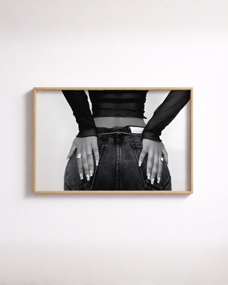
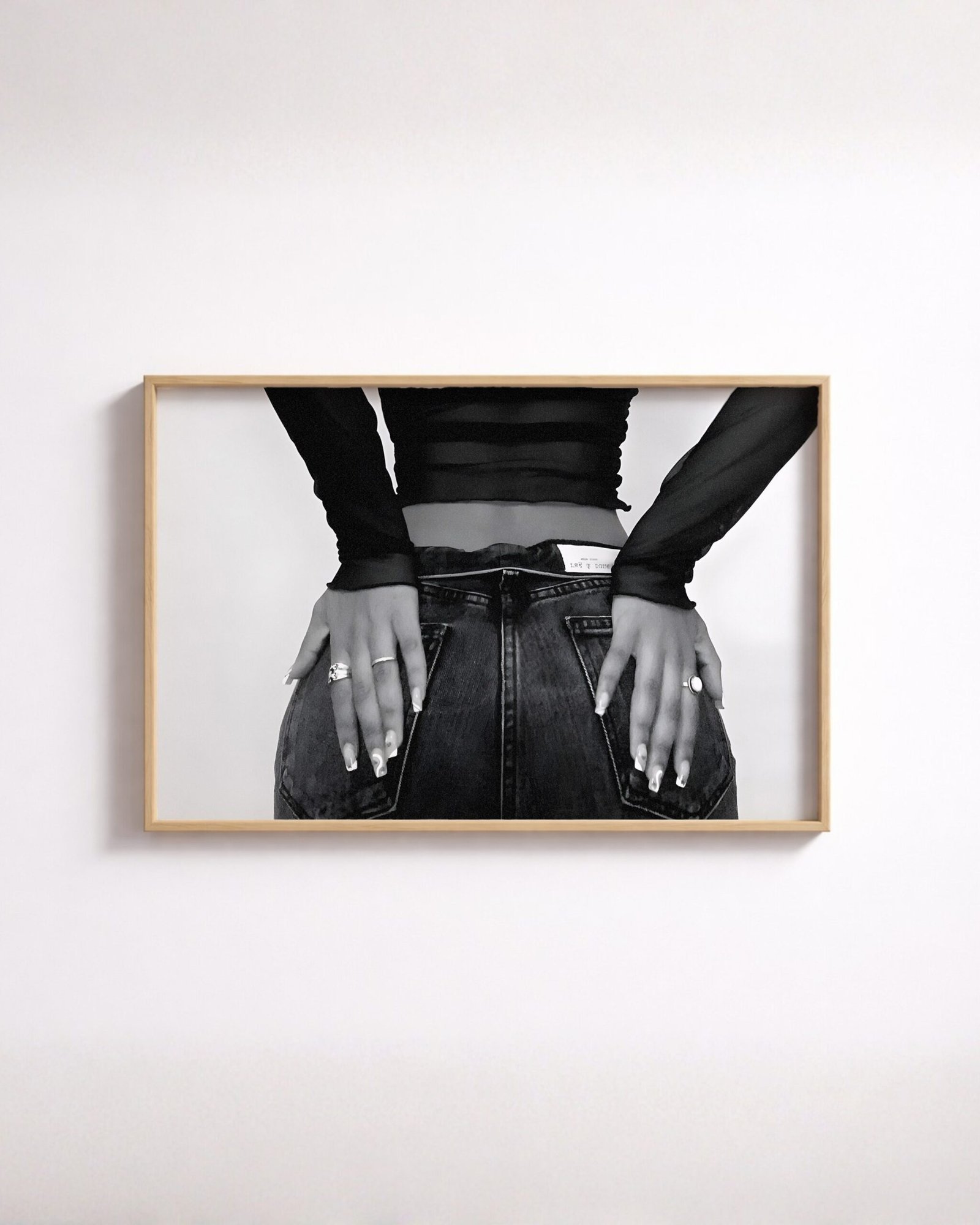
The denim editorial wall art is tighter still — hands resting on back pockets, a sheer top, almost nothing else. This is Steichen’s principle taken to its end: the subject is texture, and the garment is incidental. It is the quietest of the three and the easiest to group with unrelated work.
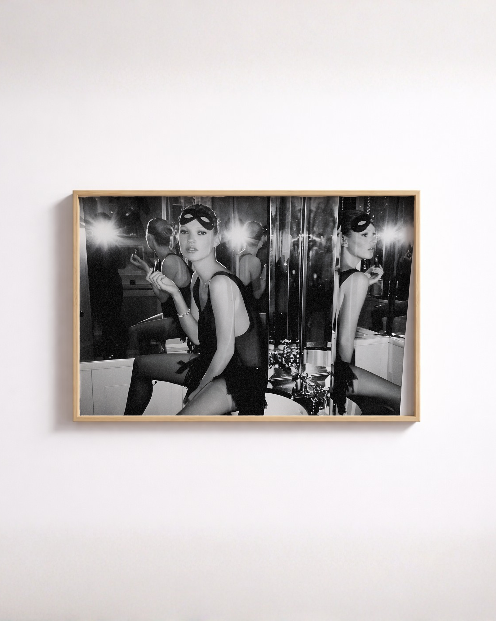
The masquerade fashion poster is the loudest: a figure in a masquerade mask and a slip dress, applying lipstick beside a mirrored wall. It is closer to a scene than the other two, and it wants a wall of its own rather than a place in a group.
Hanging two or three together
The reason to buy more than one is that monochrome photographs group. A fashion frame, a city frame and a car frame all read as the same kind of object if they are all black and white, and none of them makes the wall look like a themed collection. Try that in colour and it falls apart immediately.
The rule that makes a group work is weighting. Let one picture be busier and let the others have air in them. Two tight, high-contrast crops side by side fight; a tight crop next to a wider, calmer frame does not. If you are hanging three, put the busiest one at the end rather than in the middle.
We do not identify anybody in these photographs, and that is deliberate rather than an oversight. We do not have names on record, and inventing one would be worse than leaving it blank.
Paper and tone
Monochrome is the hardest thing to print well, because everything that goes wrong shows up in the grey. If you want the detail on that, we have written about how tonal range behaves on a matte surface. And for the wider history of the genre — the photographers, the magazines, the shift from illustration to camera — there is our longer piece on the field.
Everything is made to order and ships worldwide at no extra charge, so a group of two or three costs no more to receive than one.
Common questions
Why do fashion photographs work so well in black and white?
Because the subject is form, and colour competes with form. The V&A records a Vogue editor in 1938 telling her staff to concentrate completely on showing the dress. Monochrome does exactly that, at the cost of the one thing a dress is often bought for. On a wall, where nobody is buying the dress, that trade goes the right way.
Should the print show a face?
It is the single biggest decision. A face makes the picture about a person, and a person on your wall is a stronger statement than most rooms want. A crop below the neck, or a mask, or hands, keeps the picture about shape and texture - which is far easier to live with over years.
Can I hang fashion prints with other subjects?
Yes, and this is where monochrome earns its keep. A black-and-white fashion frame will group with a black-and-white city frame or a black-and-white car frame without any of them looking like a themed collection, because tonally they are the same object.
How many should I hang together?
Two or three, if you have the wall for it, and let one of them be quieter than the others. Three loud pictures in a row cancel each other out. A pair where one is a tight detail and the other has more air in it reads better than two of equal weight.